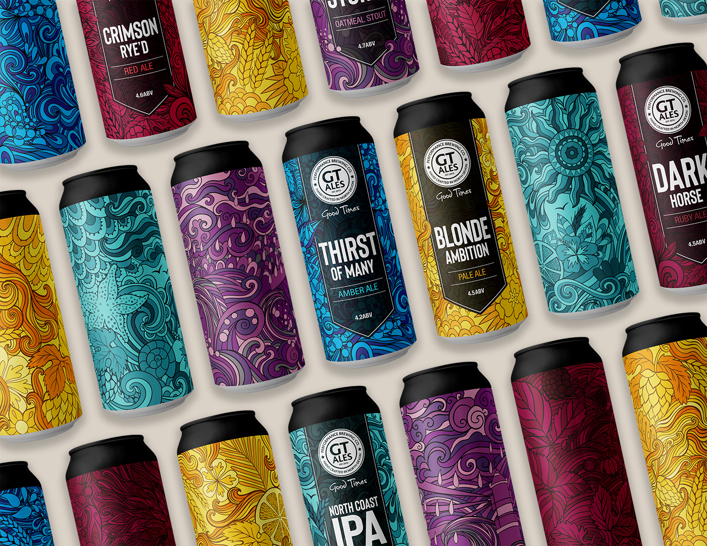

Artwork must communicate on bottle and can labels, as well as all POS material, for digital and print applications.
Must have high shelf shout in a crowded market, and ‘stand out from the masses’. Colourways and tone of voice should appeal to wide target audience of 18-70.
Maintain a consistent style, and brand look and feel across
all products, although they must also be able to ‘stand alone’.
all products, although they must also be able to ‘stand alone’.
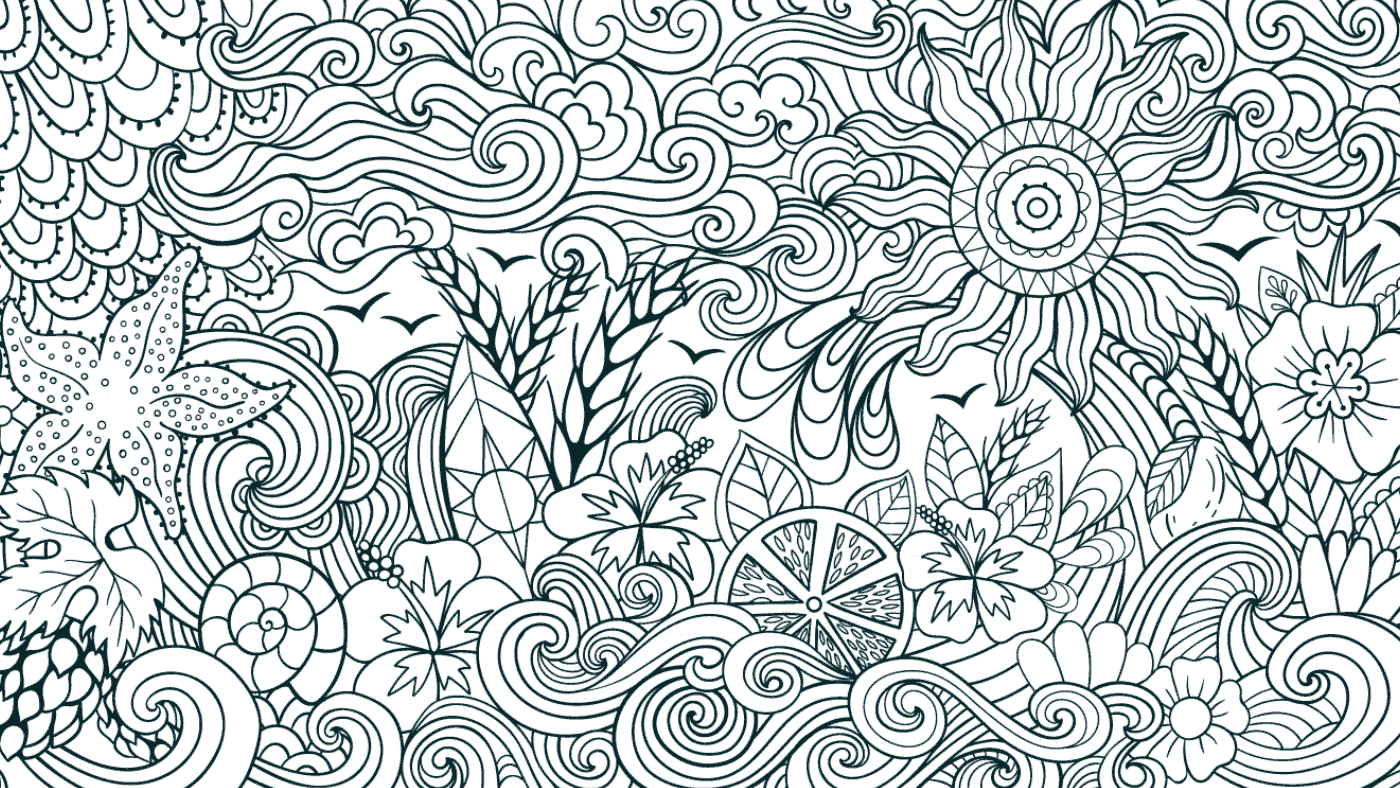
The Brands & visual thoughts
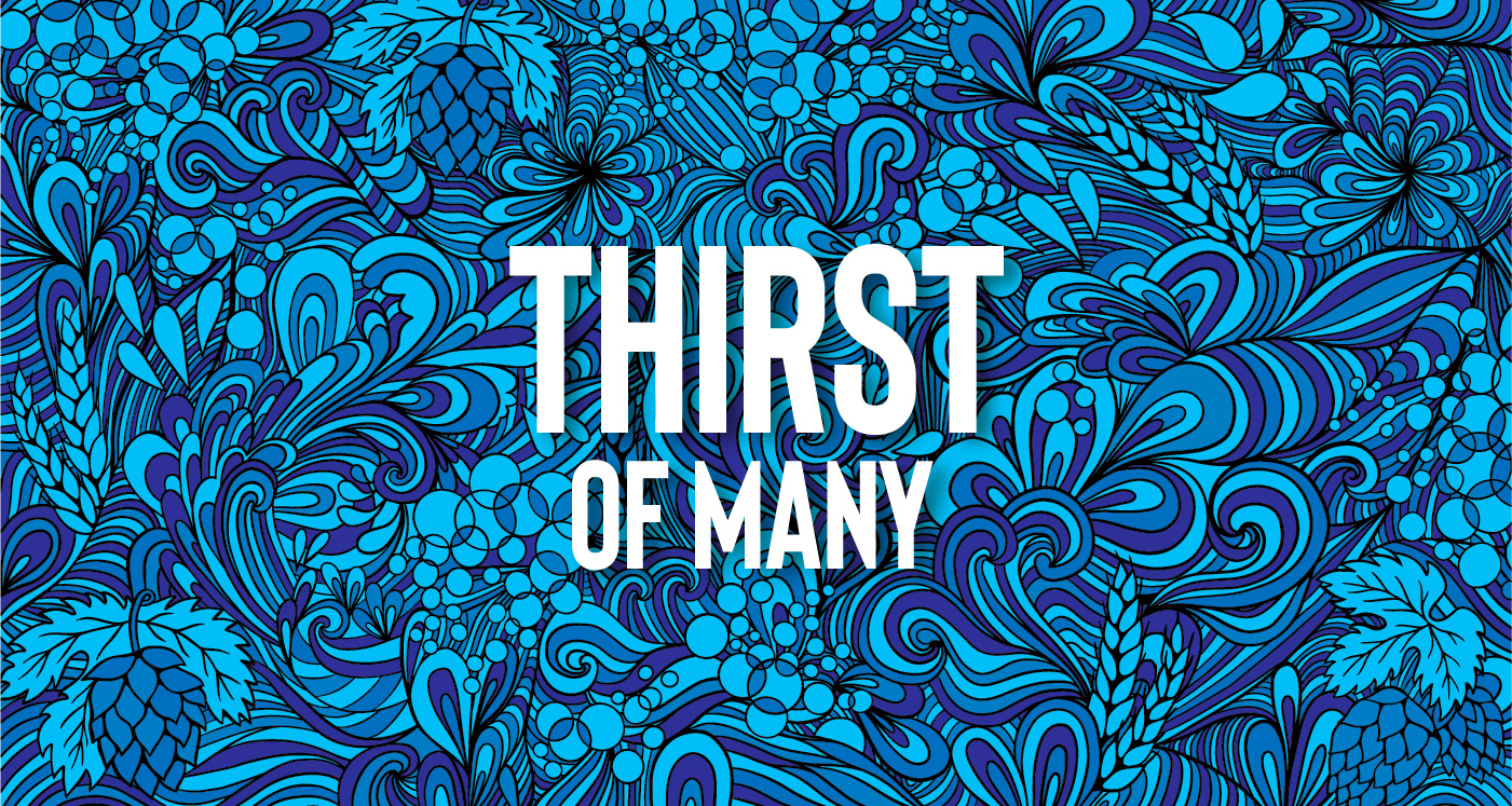
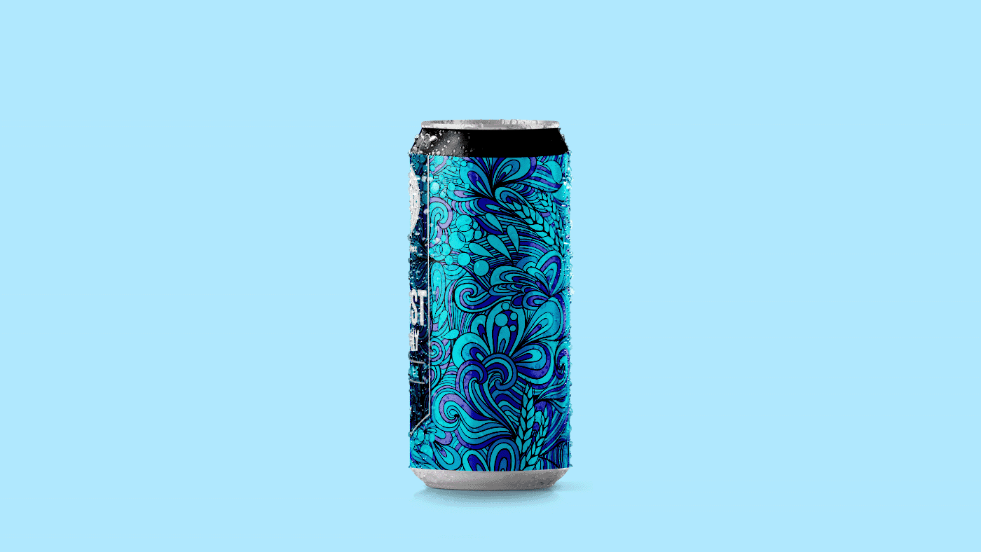
Thirst of Many:
Contrasting blue colourways with striking illustration to convey the ‘thirst’ and ‘many’ key words
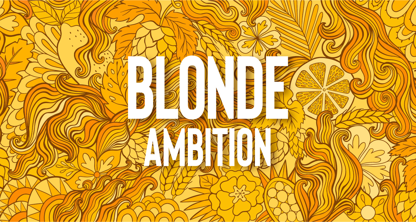
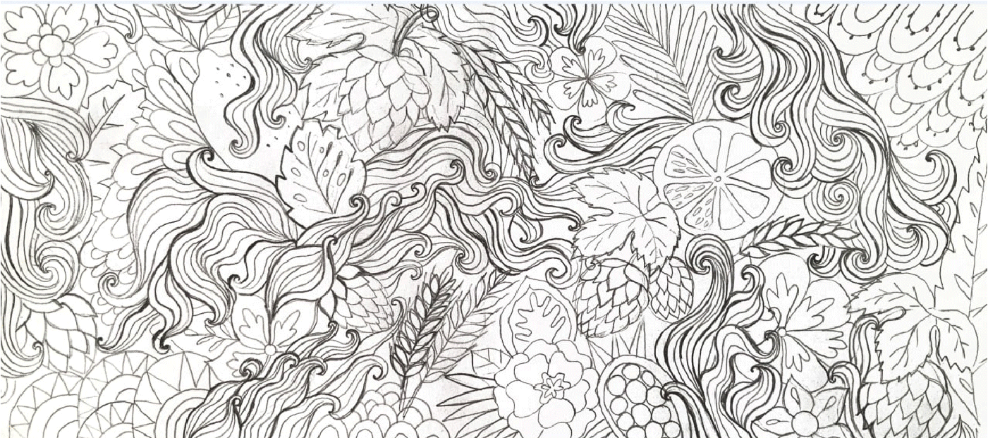
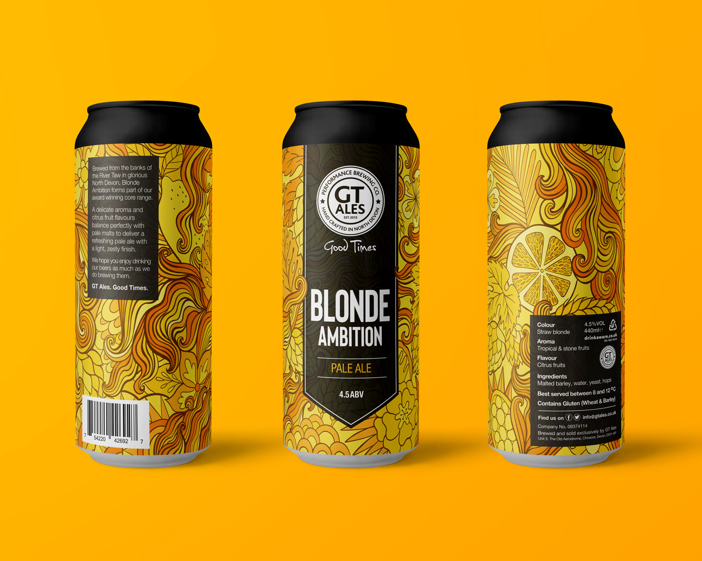
Blonde Ambition:
Colour palette of whites/golds/yellows. Illustration to feature smooth flowing lines,
hops, flowers etc. Should feel vibrant and refreshing
Colour palette of whites/golds/yellows. Illustration to feature smooth flowing lines,
hops, flowers etc. Should feel vibrant and refreshing
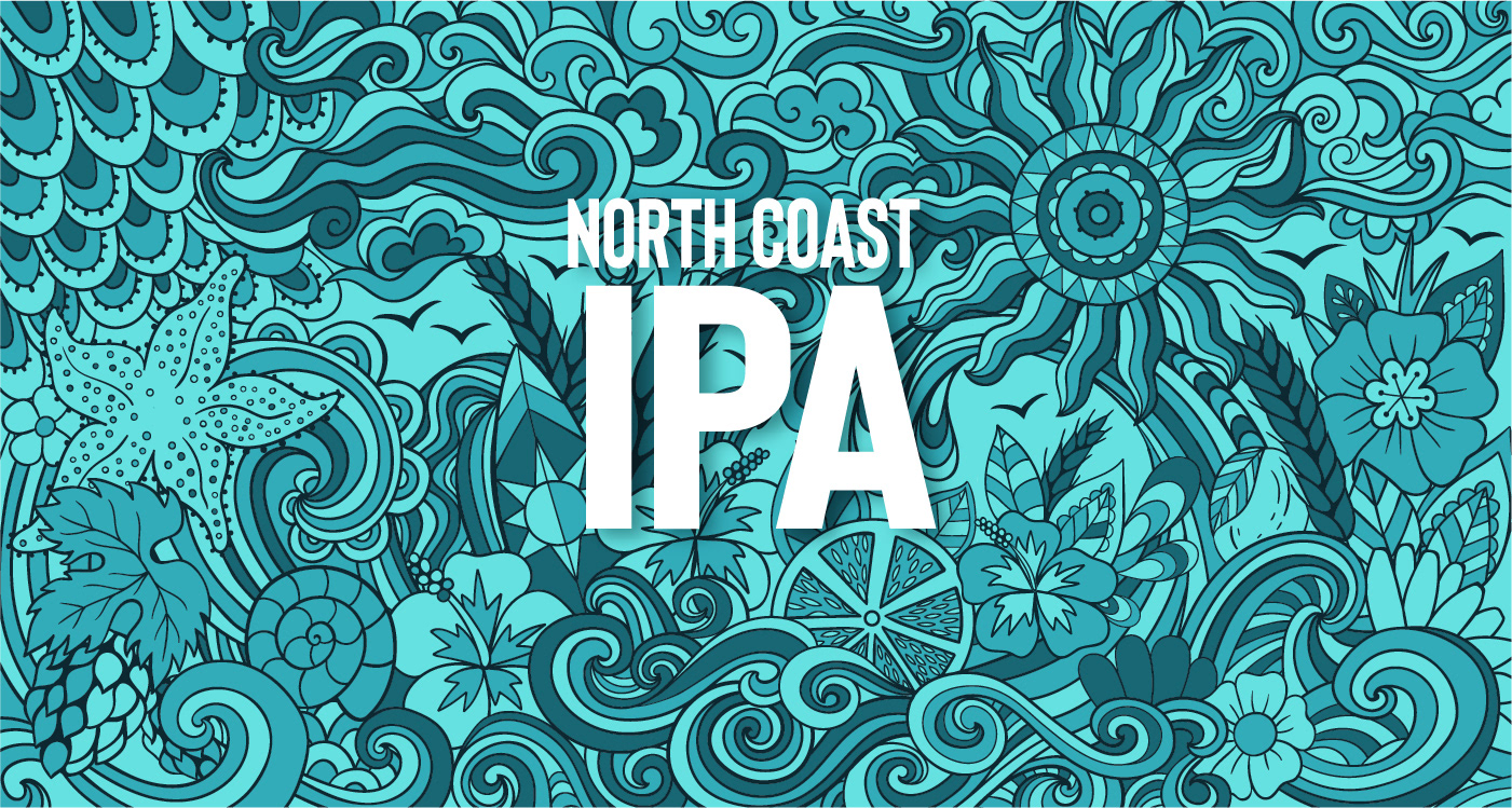
North Coast IPA:
Colour palette of blue. Should immediately communicate ‘coast’
and ‘cool’ to the consumer. Could feature sun, waves, surfers etc, and have a beach feel
Colour palette of blue. Should immediately communicate ‘coast’
and ‘cool’ to the consumer. Could feature sun, waves, surfers etc, and have a beach feel
Crimson Rye’d: Colour palette of reds/rubys/silvers
Atlantic Storm:
Use blacks/dark greys/silvers/purple. Should feel ‘space like’, so moody and dark, but cool
Use blacks/dark greys/silvers/purple. Should feel ‘space like’, so moody and dark, but cool
Dark Horse:
Colour palette of burgundys/blood reds/maroons/silvers. Should feel flowing and smooth.
Could feature horses/blackcurrants/berries as part of illustration
Colour palette of burgundys/blood reds/maroons/silvers. Should feel flowing and smooth.
Could feature horses/blackcurrants/berries as part of illustration